A cor é a parte mais fácil de reconhecer em uma roupa — e, para muitas pessoas, a mais fácil de escolher na hora de comprar. Ela parece decisiva: você vê, escolhe e assume aquela escolha. A textura exige algo mais lento. É preciso chegar perto. É preciso tocar, observar como a luz se move sobre a superfície.
Esse segundo aspecto importa mais do que gostamos de admitir.
Já vi isso se repetir muitas vezes: dois looks, ambos “neutros”, ambos aparentemente simples — e, ainda assim, um transmite autoridade, enquanto o outro parece apenas uma imitação dela. A diferença raramente está na paleta de cores. Está no peso, na trama, na superfície. Está em saber se o tecido se sustenta à luz do dia, em movimento, na vida real — e não apenas diante do espelho.
A cor é poderosa, claro. Mas a cor também é o que envelhece primeiro, sobretudo quando entra o flash ou a luz se torna chapada. A textura é o que continua convincente quando a performance termina.
A autoridade do tecido — e por que ela se impõe primeiro
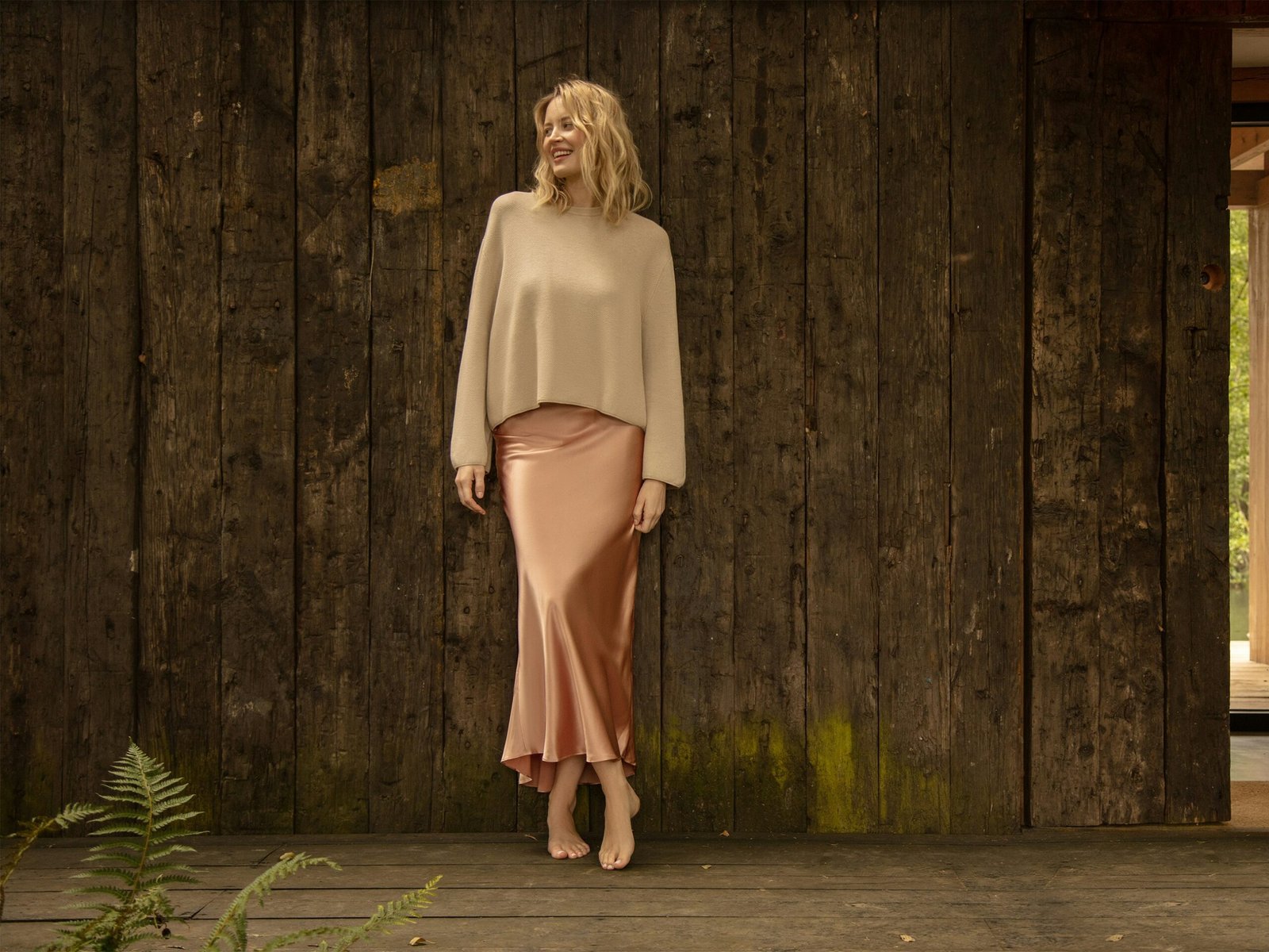
Há tecidos que se comportam como arquitetura. Uma lã densa que mantém sua linha sem se tornar rígida. Uma cashmere com peso suficiente para cair bem, em vez de aderir ao corpo. Um popeline de algodão que parece impecável porque de fato é impecável — e não porque foi engomado em excesso até a submissão. Você não precisa conhecer a marca para reconhecer esses materiais — você os sente.
Experimente isto na próxima vez em que tiver cinco minutos em uma loja: passe a palma da mão sobre um casaco de lã feltrada. Ele oferece uma leve resistência, quase prende a pele. Agora faça o mesmo com um sintético brilhante, na mesma cor. Ele escorrega. É leve de um jeito errado. Um parece firme; o outro parece apenas superfície.
É por isso que certas maisons se tornaram sinônimo de uma autoridade silenciosa. A contenção da The Row funciona porque são os tecidos que falam; não há nada mais atrás do que se esconder. O minimalismo de Jil Sander funciona quando o tecido tem substância e o corte sustenta tensão. Loro Piana e Brunello Cucinelli construíram impérios sobre uma promessa muito específica: materiais que fazem até a silhueta mais simples parecer pensada.
E a mesma lógica aparece em ícones de estilo que não precisam de novidade para parecer modernas.
Carolyn Bessette-Kennedy continua sendo referência não porque vestia cores dramáticas, mas porque compreendia linha e textura — a confiança calma de um casaco que assenta perfeitamente, a malha certa, o peso certo. Até mesmo na indumentária real contemporânea, quando a Princesa de Gales adota tons próximos, é muitas vezes a variação dos tecidos que faz o look parecer “pronto”: a estrutura do casaco em contraste com a suavidade da malha, o fosco diante de um brilho contido. O interesse é tátil, não ruidoso.
A questão não é correr atrás de nomes caros. A questão é treinar o olhar — e a mão — para reconhecer aquilo sobre o qual esses nomes constroem seu valor.
A textura é o que cria profundidade sem transformar tudo em figurino
O erro que muitas pessoas cometem ao se vestir de forma “minimalista” é supor que menos cores equivalem automaticamente a mais refinamento. Não equivalem. Uma paleta clara pode parecer sem vida; uma paleta escura pode pesar. A sofisticação surge quando você trata a roupa como uma composição de superfícies.
Lã fosca ao lado de couro liso. Uma malha escovada em contraste com uma calça de corte nítido. Um casaco estruturado usado sobre algo macio o bastante para se mover. É assim que se cria dimensão sem acrescentar ruído visual — e também é assim que se evita parecer “produzida” em vez de simplesmente bem vestida.
Aqui vai uma verdade desconfortável: a maioria das chamadas “peças de investimento” não é investimento algum. São erros caros, feitos em tecidos que não resistem ao uso real. O casaco que parece bonito no cabide, mas se revela fino quando vestido. A cashmere que forma bolinhas depois de três usos. A calça que perde a forma antes do meio do dia. Mas ninguém gosta de admitir que errou.
É aqui que a conversa se torna prática. Se você quer que uma roupa pareça cara sem parecer excessiva, faça três perguntas discretas antes mesmo de pensar na cor: o tecido tem peso? Mantém a forma? Fica melhor na luz natural do que na tela? A maior parte das decepções começa quando a resposta é não.
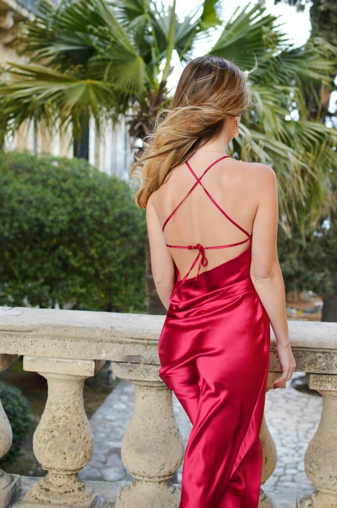
E sim, a cor continua importando. Um toque de vermelho pode ser brilhante. Uma camisa branca impecável pode iluminar o rosto. Mas a cor funciona melhor como acento quando a textura já está fazendo o trabalho mais pesado. Sem textura, a cor vira a história inteira — e é aí que a roupa começa a parecer que está se esforçando um pouco demais.
No vestir contemporâneo, os looks mais convincentes raramente são os mais ruidosos. São aqueles que se sustentam de perto. Aqueles que não desmoronam sob a luz comum. Aqueles que, ao tocar o tecido, fazem você entender por que alguém continuou usando aquela peça por uma década.
Related reading: Quiet Luxury Is Not Beige: The Logic Behind Neutral Style